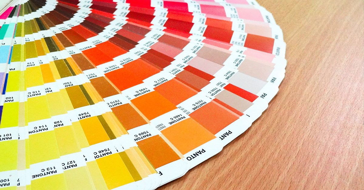
As a leading Gainesville Florida web design company, it’s our job to know every cog of the web design machine. While most people think that web design is about images only, there is actually much more to a high-quality and profitable website. Today we’re going to talk about one of those “other” factors – color scheme.
Gainesville Florida Web Design Company Talks Color Schemes

Do you know how important color schemes are to business, branding, and products? The truth is that most business owners go for colors that appeal to them personally, but they give little more thought to it than that. However, psychologists and designers alike will tell you that there’s much more to color and color schemes than liking a color.

Color Schemes Can Have Subliminal Messages
We know this sounds odd, but it’s true! Different colors have different messages or emotions attached to them and the colors you choose can send these messages or create these feelings for your clients.
Where do these subliminal connections come from, though? Most come from cultural connections and symbols that we see replicated throughout our lives and the emotions we felt when exposed to those symbols. Others are simply based on physical responses. Let’s look at a few colors to give you a better idea of what we’re talking about…
Yellow – Yellow is a color that we associate with “happiness” and “sunshine”, but did you know that painting a room yellow makes that room exceptionally uncomfortable? This is because yellow is a bright color and the easiest color for the human eye to take in. So, when we paint an entire room yellow (or create a website that’s got a bright yellow background) it creates eye fatigue and can feel extremely overwhelming. With that said, because yellow is such a bright and jarring color, we can use it for smaller accents that are designed to get attention.
Blue – Blue is a calming color that makes us feel at ease. Researchers believe that this is connected to the prevalence of the color blue in nature. We feel relaxed when we are sitting under a blue sky or sailing on the blue ocean. Interestingly, some countries have even implemented blue-tinted bulbs in streetlights and at locations known for suicide attempts. There are some who question the effectiveness of this approach, but scientists have proven that the color blue can reduce the pulse rate and body temperature. This is perhaps why you notice so many blue accents in healthcare settings.

It's Not All About How We Feel, Though
Emotion and memory play a huge part in how we respond to colors, but it’s still about more than that. Here are a few more things to consider…

Color Blindness
Color blindness makes it exceptionally difficult for some people to see certain colors. This is something worth keeping in mind when you decide on product, brand, and website color schemes. (If you’re not sure how colorblindness affects how people see color, check out this link from BoredPanda.

Astigmatism
If you have astigmatism like almost half of the world’s population, then you will know what we mean when we reference a fuzziness or halo. If you don’t have astigmatism, here’s a quick 101.
The “normal” eye has a cornea and lens that are smooth and rounded in shape. This allows for light to pass through the eye in focused rays creating a sharp picture.
When you have astigmatism, your eye is not perfectly smooth or rounded and that means that light does not pass through the eye in a focused ray. This causes things to look blurry or “fuzzy” when they are close to the eye and far from it.
Now, when certain colors are combined – bright colors on a dark background, for example, white text on a black background, something called “halation” occurs. This is when something appears to have a fuzzy “halo” around it. So combine this natural halation effect with someone who already sees a fuzziness around objects because they have astigmatism and you have text that is very difficult to read.
Since almost half of the world’s population has astigmatism, it’s prudent to keep this in mind when coming up with design themes.
Deciding on Your Color Scheme
So, how should you decide on a color scheme? There are a few tactics you can use:
- Consult with an experienced graphic designer who has experience working with color
- Colors that comprise colors – for example, purple, blue, and red. Purple is created from blue and red so they share a common thread and go well together.
- Opposite colors – looking at the color wheel, colors that are directly opposite from each other are often used in design. (Want to know why? Read this piece by Smithsonian magazine)
- Monochrome colors – colors that are all shades of a single base color
Are You Looking For a Gainesville Florida Web Design Company?
If you are looking for a new web design for your website and are interested in more than a generic site built on images alone, our design team can help. To see how we can bring your vision to life, take advantage of our free consultation by calling us at 727-475-6460!


