Since I published my Accelerated Mobile Pages guide the other day, a few of you have contacted me asking about the difference between AMP vs Mobile-Friendly. Today I want to try and clear up any confusion and explain the difference between these two mobile options.
AMP Vs Mobile-Friendly
AMP
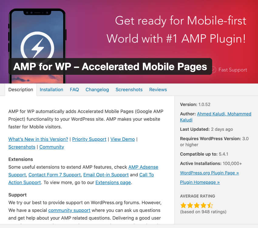
AMP is a plugin that is designed to speed up the display of your website on a mobile device by stripping webpage code down to the necessary points and eliminating any “fluff”. This means that when displaying on a mobile device, your website is much faster to load because all of those extra images and ads aren’t bogging down your load time.
When a website is optimized for mobile viewing with AMP, it is tagged on Google search results with an AMP label and small AMP logo. AMP mobile results are given favor in mobile search engine results because they offer a great user experience due to fast loading times and optimal presentation.
Mobile-Friendly
Mobile-Friendly is a label that was introduced by Google way before AMP came into being. It was used by the search engine to label websites that optimized the user experience by having a responsive format.
Unlike AMP, mobile-friendly was a label used to refer to the visual display of a website. Websites that have responsive formats are not all uniform, but they do all feature a basic foundation that allows the site to be optimally viewed on mobile devices. This optimization differs from website to website and depends on individual themes, designs, and even browsers and devices.
Google no longer utilizes the mobile-friendly label to identify websites that are designed to be responsive. Why? It’s simply outdated. According to Google more than 85% of websites these days are formatted for responsive viewing so it seems redundant and muddies the water to label them as such.
How is AMP Different to Mobile-Friendly?
I mentioned a few of the differences between AMP Vs Mobile-Pages above, but let’s cover them quickly in a short and easy to view format.
- Mobile-Friendly sites focus on website layout to provide the optimal user experience where AMP focuses on website layout and loading speed to provide the optimal user experience.
- Mobile-Friendly is an outdated search engine label because the huge majority of sites these days are built with a responsive layout, however, the majority of sites do not yet use AMP to increase the speed of website loading.
- Google does not label websites to indicate whether they are mobile-friendly or not, but it does label websites that are optimized with AMP.
- AMP is a universal method of optimizing load time and user experience because it draws on the same code format no matter the website design. Mobile-friendly sites with responsive designs, however, can vary greatly and don’t draw from the same universal online code source.
There are a few other big differences between mobile-friendly and AMP sites too…
The Serving of Websites
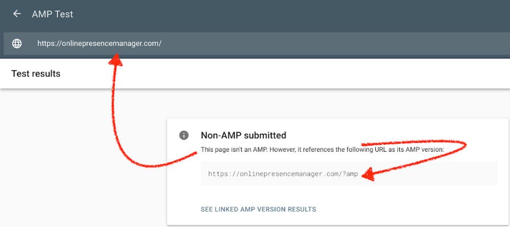
When a mobile-friendly site is accessed the layout of that site is determined by the device the site is accessed from. When an AMP site is accessed, however, the site is served via the Google AMP cache and have a URL unique to the AMP page. That means that AMP site pages that are accessed via mobile devices have a different URL to the same page if it were viewed on a desktop computer. When mobile-friendly sites are accessed regardless of the device they are accessed on, their URL remains the same.
This presents a unique issue for website owners using AMP – they end up with duplicated content because they have two URLs displaying the exact same content. To avoid this duplicate content error, you must notate webpages to let Google know when an AMP version of a page is being accessed. This is easy enough, but it does require you to actively notate pages where the mobile-friendly label does not.
AMP Pages Need to Be Validated
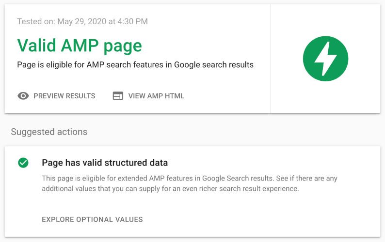
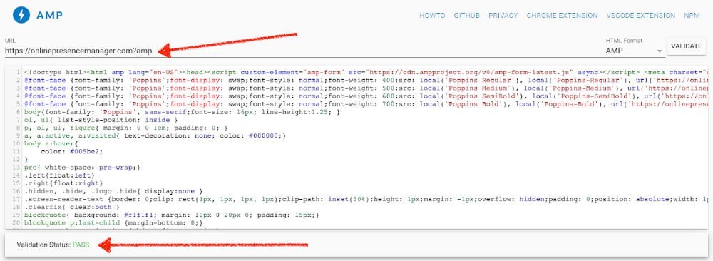
Because AMP pages all draw on the same code base, it’s important that your AMP pages utilize valid code in order to pull correctly. Fortunately, you can validate your websites AMP code using the AMP project validator here or this ad-free AMP validator.
If your AMP code is not validated then your AMP page versions will not be discovered or distributed by other platforms.
So Does Mobile-Friendliness Still Matter or Is It Obsolete?
Although the label “mobile-friendly” has become obsolete in terms of Google notations and labels, that does not mean that mobile-friendliness itself is obsolete.
Confused yet? Don’t be, it’s simple really.
For the user experience on your website to be optimal the design of your site MUST be responsive, that is, it must be displayed optimally for the device it is being accessed on.
It used to be that most sites were not optimized with responsive designs, so Google would label them as mobile-friendly so users could pick and view sites that would display well on their devices.
Now that most sites are mobile-friendly, it’s not necessary for Google to identify sites with this label BUT it’s still important to have a responsive design. So while the label is no longer a unique identifier, the process of creating a responsive design is still needed.
But aren’t AMP sites all responsive anyway? Not always.
AMP coding and responsive design are two independent elements. AMP coding strips out the unnecessary code to speed up your site but it does not change the actual design element positioning. AMP reduces the size of pages being loaded. Responsive design changes the layout of your site to suit the device you’re viewing on, but it does not stop the site from loading “heavy” data.
So What is the "Mobile First" Index?
If you try to stay on top of mobile developments and Google changes then you may also have heard the term “mobile first”. What is “mobile first” and how does it relate to AMP and mobile-friendly sites?
The idea of “mobile first” began with website designers. These designers began building websites for mobile viewing first and then adapting those sites for viewing on desktops. This is the reverse of how websites used to be developed before the rise of responsive web design and mobile search use.
So if “mobile first” isn’t a new concept why is it coming up again now? Because in July of this year, Google will roll out their mobile first index.
Just like “mobile first” designs, the idea of mobile first indexing means that Google will begin indexing your website from your mobile version of your site first. It’s important to note that as mobile FIRST, this does not mean that Google won’t index your desktop site, it just means that the mobile version of your site is where Google will begin as an indexing point.
This mobile first approach by Google will also serve as a baseline for how website rankings are determined.
What Does the Mobile First Index Mean to You?
So what does this all mean for you and how does it relate to AMP and mobile-friendly sites?
The mobile first indexing by Google fits into the grand scheme of mobile site indexing as the next step in the evolution of mobile SEO. It’s simply the progression of how Google will rank your website and AMP will play a significant role in how much weight your mobile site receives in SEO rankings.
What does it mean for you as a website owner? Firstly, it means that you need to get to work on optimizing your site using AMP. With your mobile site being the starting point for Google indexing, it’s important that the mobile version of your site is up to date and loads seamlessly.
Secondly, these changes mean that in the middle of this year you will likely begin seeing a boost in traffic to your site from the smartphone Googlebot.
So, does this mean that you will see a drop in your SEO ranking?
It depends.
If the mobile version of your site is equivalent to the desktop version of your website with content that has been optimized for viewing on any device (AMP plays a huge role in this!), then you shouldn’t see any significant impact of mobile first indexing on your site. Why? Because the mobile version of your site is effectively the same as the desktop version of your site.
If the two versions of your site are drastically different or if you don’t have a mobile version to your site yet (shame on you!), then it’s time for a site redesign and the implementation of AMP.
Confused on AMP Vs Mobile-Friendly?
If you’re still confused on the difference between AMP and mobile-friendly tags or if you just want someone to come in and take care of optimizing your site pages for you or redesign your non-mobile-friendly site, we can help. Pick up the phone and dial 727-475-6460 to claim your free consultation today to see how quickly we can get your site on the right track!

